
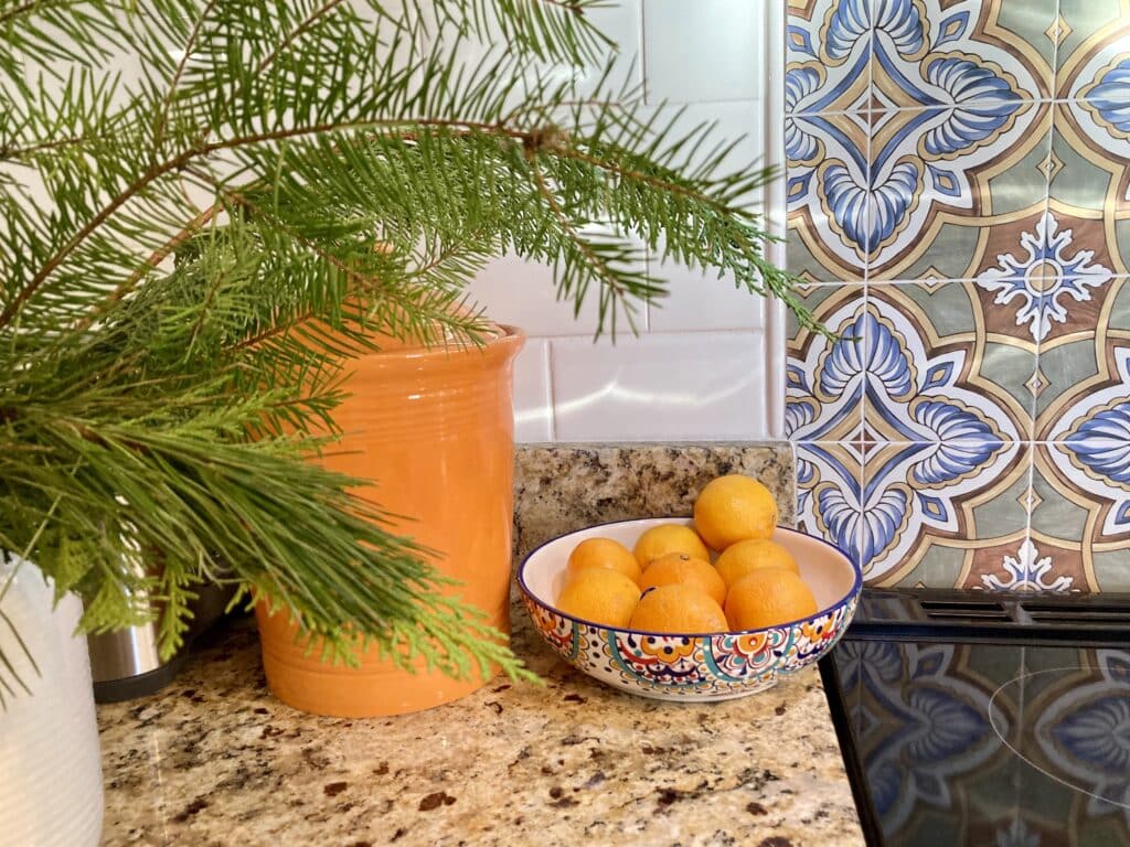
After my half-awake post yesterday about bad light, the sun came out in the afternoon and I got some “glamour” shots of the tile in situ.
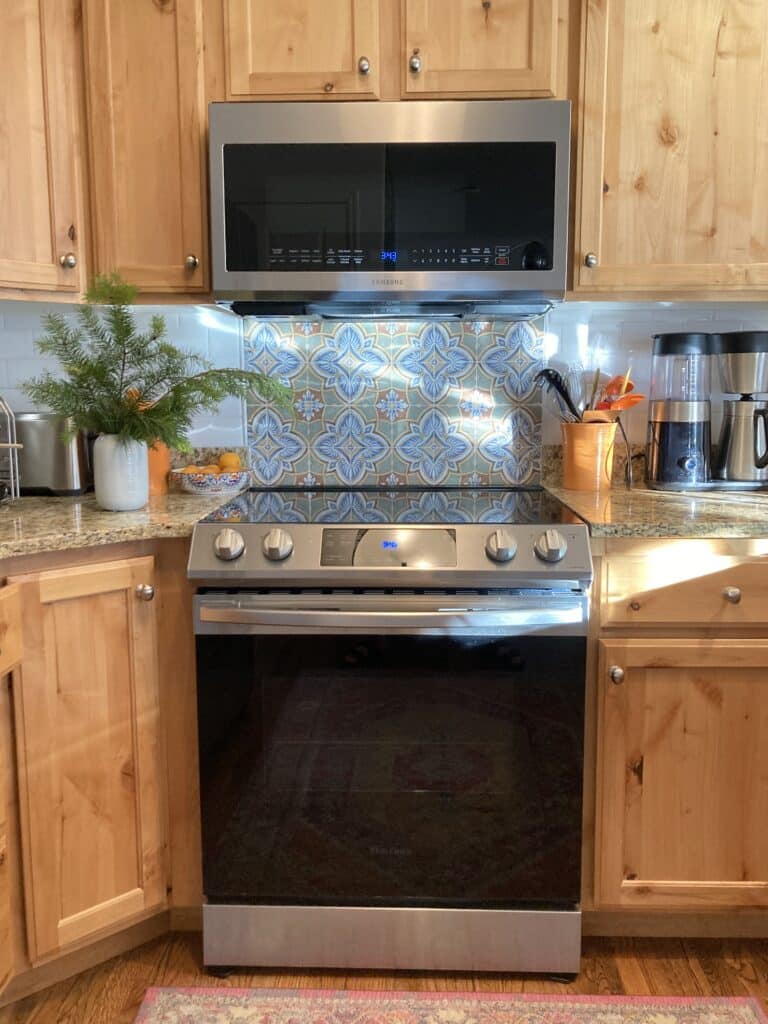
The thing about fancy home magazine photography is that they 1) use actual photographers and 2) stage everything within an inch of its life (“there can be no sign of living in this house!!“). But I think these photos show how the tile is doing what I wanted it to do: distract from the cabinetry and blend with the granite (accent) and bounce around the light (subway).
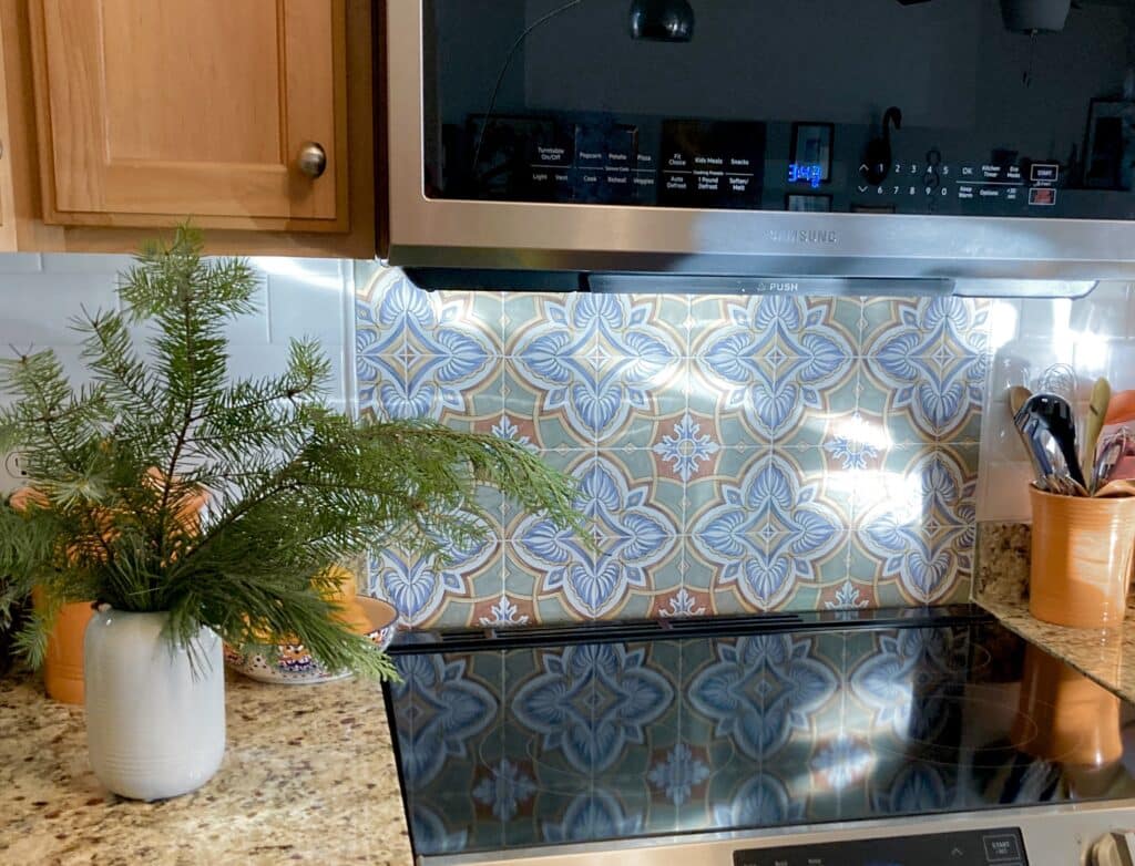
I’m also really pleased how backsplash plus the cabinet we added finally “finishes” the end of the kitchen as it moves into the dining area: 
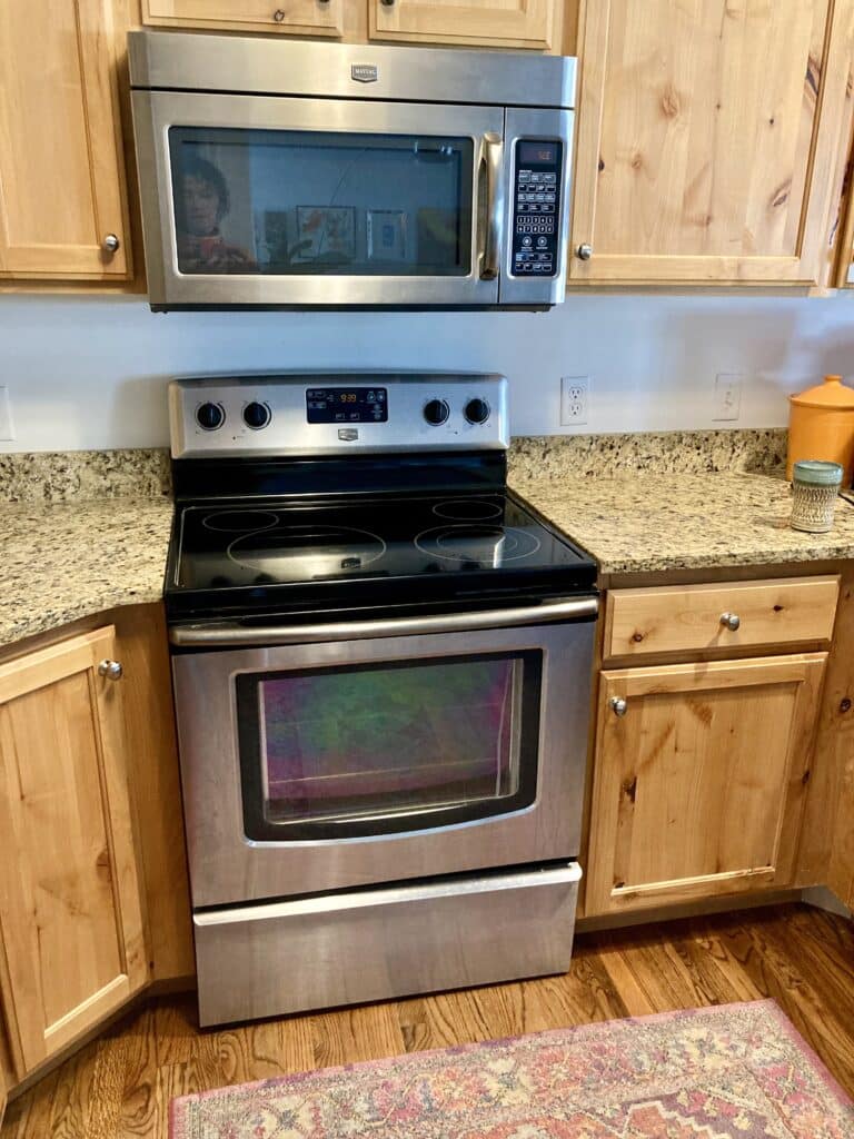
As a reminder, this is where we started, untouched since 2011:
And this is where we’re at with (relatively) minimal effort!
“Relatively” is doing a lot of work up there, lol, but for not doing anything too major, the kitchen really feels new.